


What not to do in dental branding
Walking through downtown Portland the other day, I happened to notice this sign for a dentist called “Gentle Dental.” Having worked with dental clinics in my capacity as a branding specialist, the sign got my attention for all the wrong reasons. I instinctively had to shudder just looking at it.
Dentistry is an interesting branding challenge because people don’t inherently want to visit the dentist. Even though modern dentistry is pretty much pain-free, the mental association is generally not a pleasant one. So dentists have a much harder time than, say, restaurants do in making their brand appealing. To counter the built-in perception, dentists need to work hard to avoid any of the existing negative connotations.
Unfortunately, the sign I saw didn’t counter those mental associations; it emphasized them!
As I understand it after some research, Gentle Dental is a franchise with over 100 clinics across the USA. It’s not an original name, being used by dental clinics all around the world, all of them with different brand identities. For that reason, it would be more important than ever for a franchise trying to establish credibility to have a very strong identity. I’ve seen some green and blue Gentle Dental logos which appear to be the same company because the logo is the same design, although the font and colors are different. Perhaps a rebranding is in progress. If so, it isn’t consistently being applied.
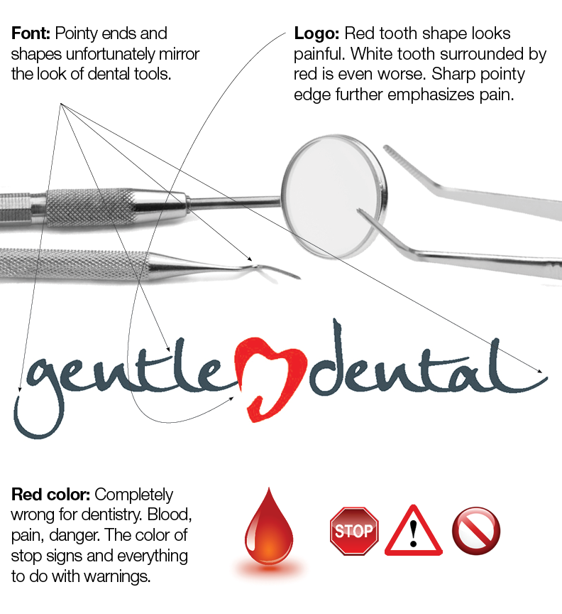
Here are some of the problems with the logo for this particular practice:
Logo Design
The logo on the Gentle Dental sign is a blood red color. Dentists should never use red on their logo. It’s completely the wrong association. Red is mentally connected to blood, danger, warnings, pain and other barriers to action. I don’t object so much to red in the text portion of a word mark or clinic name. But never on the logo. People are already thinking of these things; you don’t want to link that even closer just when you’re trying to get them to respond.
Even worse, the logo has the image of a white tooth surrounded by red, making it look like a badly swollen gum line. And there is a sharp pointed edge on the left side that speaks of pain.

A look at the main problems. Click image for larger version.
Typeface
The font used for the Gentle Dental signage is also a strange choice. It appears that the designer was trying to make the logo appear friendlier by using a handwritten font. Unfortunately, it’s a font filled with the appearance of sharp, pointy edges and shapes that mirror those used in dental implements. This further associates the name with the things people hate about dental visits. In reality, the ends of descenders are rounded but that’s a technical distinction. The visual impression at first glance is of dagger-like points.
Some people may note that Gentle Dental, as a franchise with many locations, has been successful. This doesn’t mean their success was the result of this poor quality branding. Some companies do manage to be successful despite challenges. People too. Double amputee Amy Purdy has been very successful as a competitor on Dancing With the Stars, performing better than many able-bodied contestants. That doesn’t mean people who want to dance would be more successful by having their legs removed. Poor branding makes it harder to succeed. Some companies are able to grow despite badly designed identities. Imagine how much more successful they would be with good branding!
Double amputee Amy Purdy has been very successful as a competitor on Dancing With the Stars, performing better than many able-bodied contestants. That doesn’t mean people who want to dance would be more successful by having their legs removed.
Suggestions for Dentists
Dentists should never use red except in the clinic name. Their logos should avoid sharp, pointy corners and any hint of relation to dental instrumentation. Text should be smooth and warm in styling, looking soft. Rounded corners are great, though not necessary. Modern typefaces are fine, as long as they don’t have descenders or other parts that come to spiky points.

Ignoring the logo for a moment, even a change of font and colors can make a significant difference.
If you want a review of your brand identity, contact George Pytlik for a free initial consultation.
No Comments